

Role & Summary
When cinemas and live events closed, BookMyShow's core business stopped. The product still had an audience and nothing to sell them. Watch Guide was the answer: a discovery hub telling users what was streaming, where, and when — across platforms BookMyShow did not own and earned nothing from directly. It meant a ticketing company actively pointing its users toward Netflix and Prime. The bet was that staying useful while the core business was frozen mattered more than protecting transactions that were not happening anyway. Daily visitors started at roughly 3,000–4,000 and doubled, with peaks near 25,000 — during lockdown, in a category the company had never operated in.
Business Context
BookMyShow sold tickets to things you left the house for. In 2020 that category disappeared overnight.
The audience did not disappear with it. People were consuming more entertainment than before, just none of it through BookMyShow. Attention moved to streaming, and the product had no reason to be opened.
Two things were at stake. Engagement: a product nobody opens for months is hard to restart when cinemas reopen. And revenue: if daily usage could be sustained, an ad-supported stream could work even with no ticketing at all.

Strategic Decision
Be the guide, not the gate.
The alternative was to keep users inside. BookMyShow had its own streaming and pay-per-view offering, and the natural instinct was to surface only what the company could monetise directly.
We chose breadth. A guide that lists one platform is not a guide, and users would have recognised it immediately as promotion rather than help. Being genuinely useful about competitors was the only version that could earn a return visit — and return visits, not transactions, were the thing worth measuring during a lockdown.
The cost we accepted: no direct revenue from the content we surfaced. Watch Guide had to pay for itself through engagement and eventual advertising, on a longer timeline than any transactional feature would have been held to.
Design Principles
Answer what, where, and when. Every element earns its place by answering one of those three.
Be honest about competitors. Platform coverage is the product; hiding a platform breaks the premise.
Decide faster, not browse longer. Success is how quickly someone stops using Watch Guide.
Key Product Decisions
Structure around availability, not catalogue
The organising question was not "what exists" but "what can I watch, on something I already have."
That made platform, language, and content type the primary metadata rather than genre or popularity. A user's real constraint is their subscriptions, not their taste.
Series needed more than a title-level answer. A show can be split across platforms by season, so the guide had to resolve availability per season rather than per show — the detail that separates a useful guide from a list.
Content type, separating film from series, was added later in the roadmap rather than at launch, and click-through increased when it arrived. In hindsight that was the clearest signal that we had launched organised around availability when users were also filtering by format.
Teach the offering before asking for attention
This was a new category for BookMyShow's audience, and a home-page entry point alone did not explain it. Users arriving on Watch Guide did not know what it was for.
We introduced the offering through a parallax scrolling sequence that explained it as the user scrolled into the page, rather than through a modal or a tooltip tour that would have to be dismissed before anything useful appeared.
Give users a reason to return weekly
A guide gets used at the moment of need and forgotten otherwise, which is fatal when the goal is daily active use.
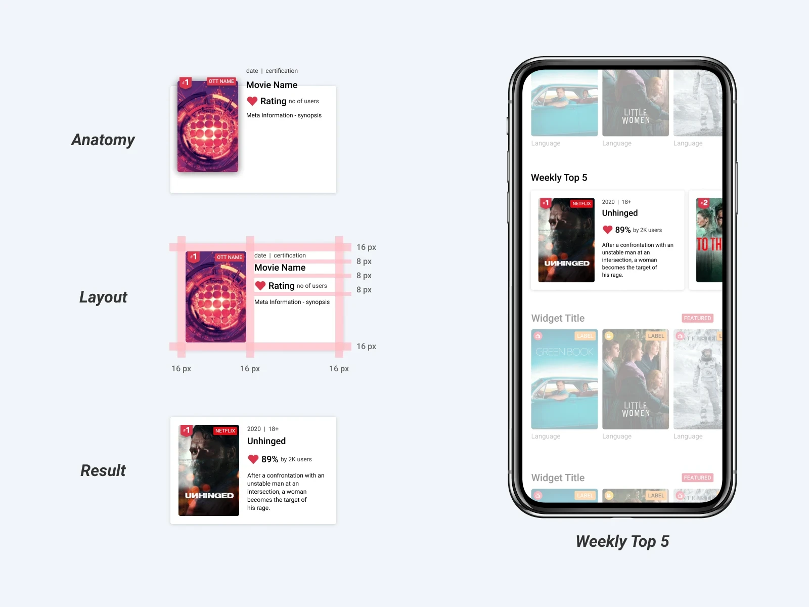
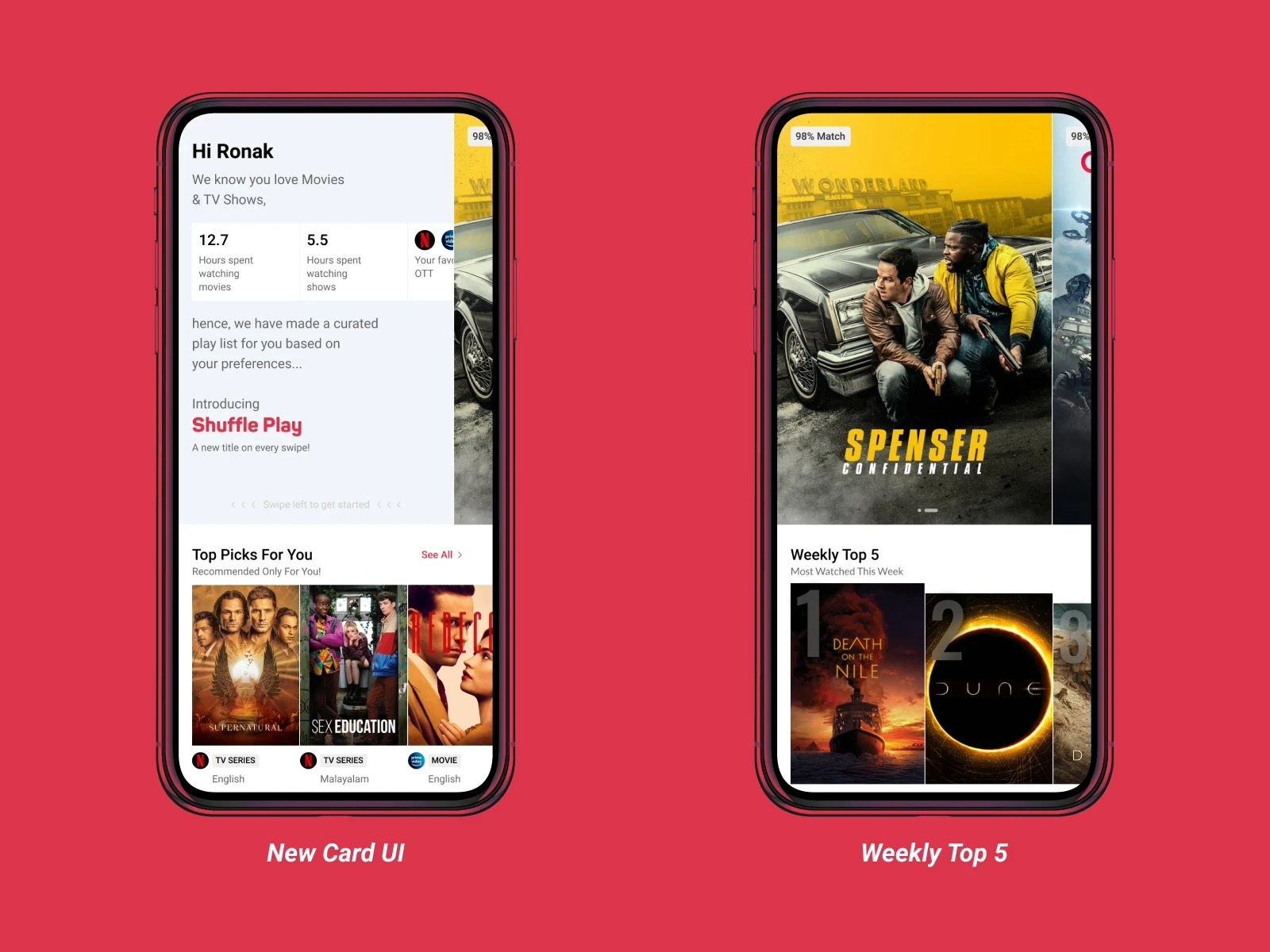
The weekly top five across platforms created a reason to open the product without a specific title in mind. Each card carried a short synopsis, so the card itself could settle the decision rather than sending the user somewhere else to find out what the thing was.
Let users act, not just read
Ratings and watchlist were the two interactions that turned a reference page into something with memory.
They also produced the only first-party signal Watch Guide had: what a user cared about, independent of anything they had ever booked. For a company whose entire understanding of its users came from transactions, that was a new kind of data — and it is what later personalisation was built on.
Outcomes
Customer. Daily visitors grew from roughly 3,000–4,000 at launch to roughly double that, with peaks near 25,000 — achieved during lockdown, in a content category BookMyShow had never served, with an audience that had no prior reason to expect it there.
Product. Adding the content-type distinction measurably increased click-through, confirming that availability alone was not how people searched.
Platform. Watch Guide continued as an active roadmap rather than a one-off lockdown feature. Later additions included NLP-powered search to make discovery more direct, and a preference capture mechanism used to surface relevant content — both of which depended on the rating and watchlist signals the original design established.
Business. The strategic outcome is the one without a number attached: BookMyShow stayed open, useful and visited during a period when its core inventory did not exist. That was the purpose.
Reflection
The lesson I still use is that usefulness and monetisation do not have to arrive on the same screen.
The instinct during a crisis is to pull users closer to the transaction. The better move here was the opposite — be the most useful thing in a category we did not own, and accept that the return came later and indirectly.
What I would do differently: the guide launched organised entirely around availability, and content type — a distinction that turned out to raise click-through — arrived later. We designed around the question we assumed users were asking, rather than establishing how they actually searched before building the filters.

